A good look in the mirror to improve my art - photography review
Last week I critiqued some photos from some of my competitors. This time, it’s time to turn the lens back on myself, and take a look at some photos I’ve taken. Spoiler alert, they’re not all great. I’d like to use some of my better photos to discuss the direction I want my art to go, to help narrow in on my niche, and build some ideas for future shoots.
It’s something I strongly suggest all artists do. I’d also like to take a look at some photos that were not so successful, to help me and you get a feel for what to avoid. It’s a hard fact of life if you want to be an artist: The only way to improve is by constant self-criticism. If you don’t do it yourself, you’ll be at the mercy of the type of critic you saw in the beginning of the video. So let’s do this.
Ok, as you know from last week, I’m a bad news first person, so we’re starting with the ugly.
Las Vegas, Nevada
This is an installation called The Seven Magic Mountains, near Las Vegas. The concept here was to create a feeling that the installations were lifting off into space. The result just doesn’t convey that. My older Canon cropped frame camera wasn’t able to get enough of the night sky to add that feeling of outer space into the story. The ground light effect I used just didn’t do what I wanted to do either. It ends up being a bit confusing. When I look at it, I just wonder what that light is supposed to be or represent. It doesn’t add to the story, and it doesn’t create a really interesting visual. I would have preferred to take more time lighting the towers themselves, to bring out the color and texture that they present, and done less lighting at the base. I think what threw me off on this one is just the scale. It’s actually quite large, and that presents some issues that I haven’t yet been able to overcome. I can do better.
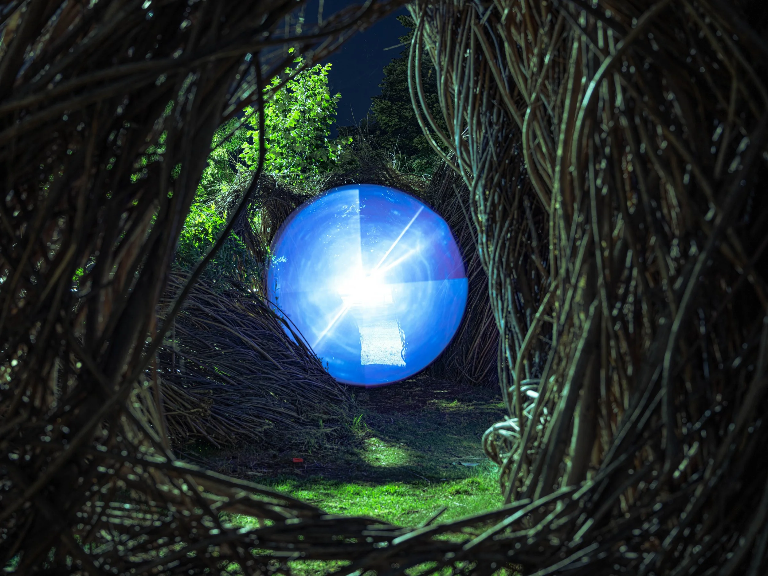
Palo Alto, California
Here’s another one from fairly early in my explorations. I was still using the cropped sensor, which just didn’t get enough detail to really create the contrast I’d like to see here. I would have liked to pull back from the scene a bit to create more of a tunnel effect, but I didn’t have a wide angle lens, and the space was tight. Composition-wise I would like to have the portal a bit off-center so it doesn’t dominate the scene quite so much. The branches on the left could be lit better to bring out the texture, the deep shadows and bright branches like you see on the right side. That creates an imbalance in the photo that I don’t like. I’d also prefer that the leaves in the back wouldn’t be so bright, but there was a street light to deal with. I really need to come up with a way to handle that, it seems to happen a lot. It was such a cool installation, wish I had been able to get more depth of field, and a more interesting image. I was planning to go back, but a car ran over a big piece of it, and the whole things was removed a few days after this shot. Another lesson, take advantage of what’s in front of you today, we never know what tomorrow will bring.
Sequoia National Park, California
This one was so close to being a great photo. I like the way it’s composed, I like the colors, and I love the reflection on the water. The reason this goes into the bad pile, is that the light effect is just a random rainbow. It’s not inspired by the location, it doesn’t add to the location. Just throwing a blob of color into a beautiful scene is not good enough. It should look like it’s meant to be there, an accent to nature, not competition for it. If I were to do it today, I’d probably change the orientation of the light, make something that looks like a path lifting out of the water into space. Live and learn folks.
Perfect, now I get to show you what I can do. These are some images that I love, and have gotten great feedback on. Let me tell you why.
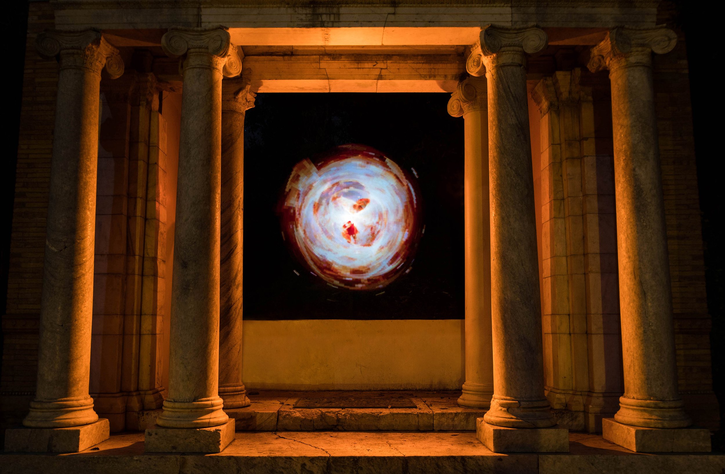
Golden Gate Park, San Francisco, California
This is one of my favorite portals. I took a long time to get the lighting on the columns and floor, so that it appears light is emanating from the center, and gives a balance of light and dark. The effect is that the structure looks like it was built in ancient times as a machine to generate this portal to another dimension. The portal looks like it was meant to be there, which allows the viewer to suspend their disbelief, and feel as if this isn’t an element added by me, but something that has existed there for millenia. It’s a great story, I just love the way it expresses itself.
Goldwell Open Air Museum, Rhyolite, Nevada
This is one of my absolute favorite photos, in the ghost town of Rhyolite, of an installation called Last Night’s Supper (print on sale). The feeling of vital energy is so strong here. I just love the effect of making these static concrete sculptures into living beings. The blue color and lens flares give a feeling of calm, while at the same time adding a sense of movement to the scene. It brings the figures together as one. Then the orange lighting inside the sculpture makes the beings seem to radiate a life force, as if it’s been breathed into them individually. This creates a tension to the piece, and makes me feel that although they are separate, they’ve been created and sustained by some divine creature. Love the narrative here.
Finally, here’s one that you watched me create, or click here if you didn’t catch it yet. What I like about this one is the feeling of the artwork being isolated from it’s surroundings. The light behind and below almost seem to be encasing the circles, as if some sort of energy is creating them as we watch on, or perhaps transporting them. The lens flares in the center of the circles also give a sense that perhaps these circles are somehow alive, that they’re watching us. I just love being able to creat something that has elements of the familiar, like the city lights behind, but yet seems completely outside of our experience, alien or surreal.
This should give you a better sense of who I am as an artist, what my creations are all about. It helps me to continue to define that. Every artist evolves, and continues to develop throughout their career. Self-criticism is a big part of that process. It keeps me from becoming stagnant, keeps me moving forward and improving. And hey, you know what else helps me move forward and improve? You got it, the all-important Like, Subscribe, and Notification buttons. And if you’re really feeling like aiding my evolution, leave a comment on any of the photos you’ve seen in this video. I always love to hear other perspectives on my work, so I can take that feedback and put it into future efforts. Big love for your time and attention, it’s so great when we can grow together. Have a bright, and focused week, and I’ll see you soon.
—> Watch this on Youtube by clicking HERE.


